Unless you’ve lost all network connections over the past couple of weeks, you know the big news: Canonical announced it was dropping Ubuntu Unity and returning to its GNOME roots. Whether you think this is good or bad news, it’s happening. When the official Ubuntu 18.04 is released, it will be all GNOME. For those that have been happily using Unity for years, will this translate to a lesser experience and a learning curve for the new Ubuntu desktop?
Not completely. Yes, there will be features missing (some of which you may have grown to love), but the GNOME desktop has become an incredibly solid and user-friendly experience, one that can go a long way to help you be productive… and do so in style.
I want to compare some of the similarities (and differences) between Unity and GNOME, so anyone concerned they’ll soon be on the market for a new Linux distribution can be rid of those fears. Hopefully, by the time you finish reading this, you’ll be excited for the upcoming changes to the Ubuntu desktop.
The Dash
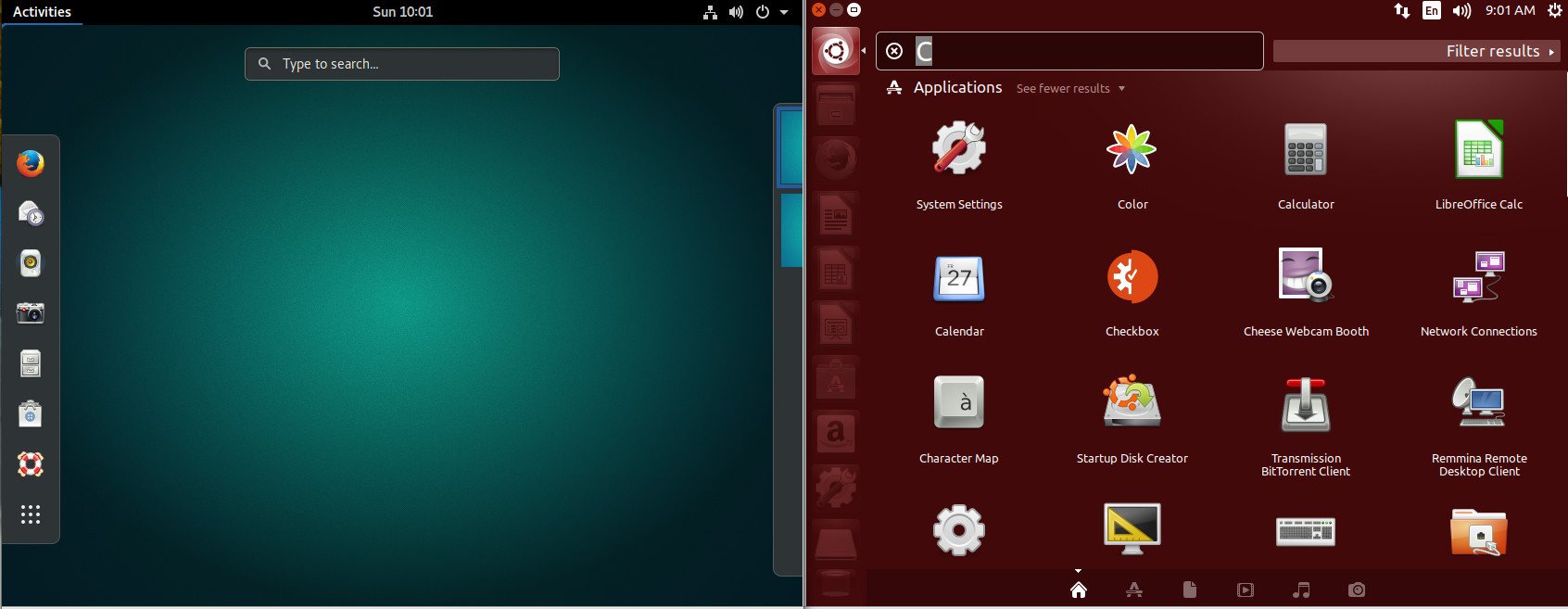
We’ll start off with some good news. Both Unity and GNOME have a feature called the Dash. For those that have been working with the Unity Dash, you’ll be happy to know the GNOME Dash is just as powerful. Not only can you launch and manage all of your apps from the GNOME Dash, you can also search for documents, locate software to install (with GNOME Software integration), work with dynamic workspaces, and even add apps to a special Favorites launcher (that functions in similar fashion to the Unity Launcher). Even better, you can extend the functionality of the GNOME Dash by addings extensions (more on that in a bit).
A quick visual comparison of the two different Dashes (Figure 1) seems to point to the Unity’s Dash offering quite a bit more in the feature department (such as a very powerful search filtering tool). To some, those added features were one of Unity’s biggest failings; it tried to do too much. With GNOME, you get a simpler experience.
Launcher
If we take a look at default desktops, driven by both Unity and GNOME, we see a fairly stark difference (Figure 2). With the Unity desktop, you have a Launcher, where you can open the Dash and add application launchers. With GNOME, that feature is tucked within the Dash (in the form of the Favorites bar).
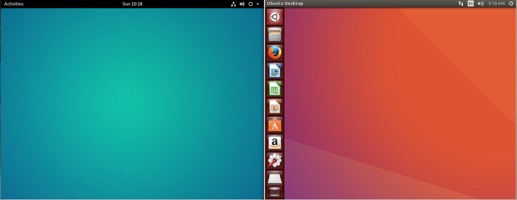
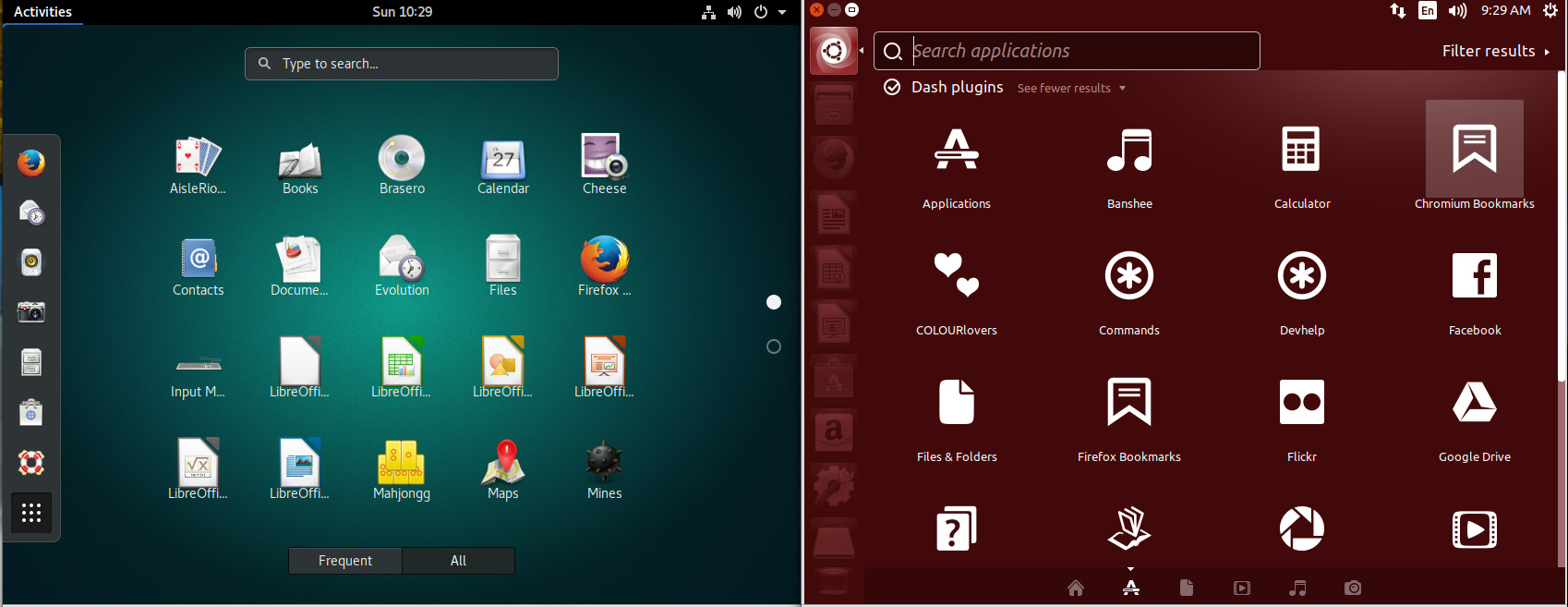
This being GNOME, of course, we can actually add a dock-like-feature with the help of an extension (more on that later). However, without that extension, to get to all of your applications, you must open the Dash (click on Applications in the upper left corner or clicking the Super key on your keyboard) and then click on the grid of dots at the bottom of the Favorites bar. As you can see (Figure 3), the GNOME Dash application listing offers a somewhat similar experience to that of Unity. The biggest difference is the inability to filter results (beyond All or Frequent).
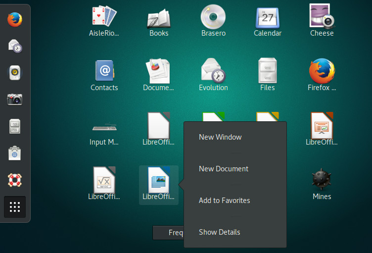
While in the application listing, you can right-click an application icon and click Add to Favorites (Figure 4) to include that launcher in the Favorites bar.
Global and Heads Up Menu
We’re about to find out one of GNOME’s shortcomings. I’ll begin this by saying GNOME’s take on menus can be a bit confusing at first. With some applications, you’ll find two menus: The application menu and the Global menu. The application menu is the standard, straightforward menu found within an application. The Global menu is a menu found in the titlebar of an app. Sometimes that Global menu is the only menu for an app. Depending upon the application support for Global menu, that menu will either offer only options for various elements of the application window (such as New, Preferences, About), or it will serve as the full-blown application menu (in lieu of the standard toolbar menu). To make this a bit more clear, open up LibreOffice, and you’ll see a standard menu toolbar, as well as a Global menu (Figure 5).
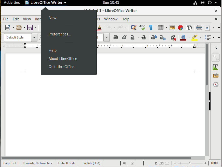
In the above image, I’ve opened the Global menu associated with LibreOffice, where you can open a new file, gain access to the LibreOffice preferences window, get help with and quit the application.
However, open Rhythmbox (the default music player in GNOME) and you’ll see there is only one menu—the Global menu—which contains all of the Rhythmbox menu options (Figure 6).
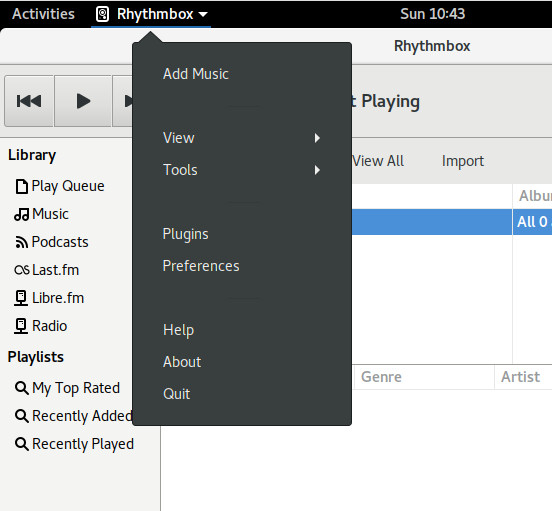
The reason for this confusion is that not all applications have come on board with the Global menu system. I hope, now that Ubuntu is shifting back to GNOME, this will change so we’ll see a more consistent menu system for the desktop.
If there is one feature that power users will miss from Unity, it’s the Heads Up Display (HUD) menu. This allowed the user to hit the Alt key and bring up an overlay that would search an application’s menu. This made it incredibly easy to find the exact menu entry you wanted. Say, for example, you wanted to center text in a LibreOffice document. Type your text, highlight it, click the Alt key, type center, and then select Centered (Figure 7).
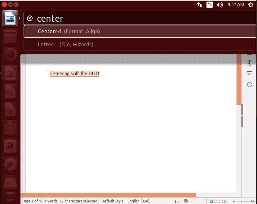
With the HUD, you could work within an application without having to take your hands from the keyboard—something quite important to those who regard efficiency over all else.
Extensions
Now we come to a part of the program where GNOME clearly outshines Unity: extendability. This has always been an issue with Unity—a certain lack of configuration options. With GNOME comes extensions. GNOME Extensions are small pieces of code, written by third-party developers, that extend the desktop in many and varied ways.
Let me show you how to easily gain a dock (similar to the Unity Launcher) with the help of the Dash To Dock extension. To do this, open up the Firefox browser and head over to the Dash To Dock page click the ON/OFF slider to the ON position and click Install (when prompted). The Dash To Dock extension will be added and you can now enjoy the Favorites bar as a standard desktop launcher (Figure 8).
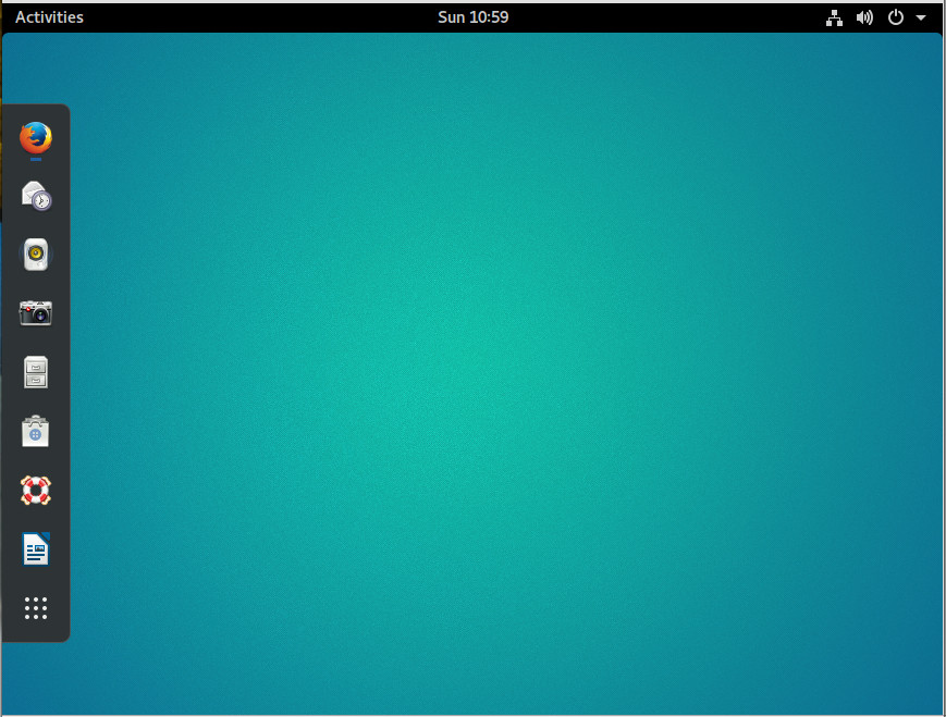
Whenever you add an app launcher to Favorites, it will automatically show up on the Dock.
You’ll find a vast number of Extensions that can be added to the GNOME desktop.
Prepare for the change
At this point, it’s just a matter of waiting. April 2018 will see the first release of Ubuntu with GNOME as its official desktop. Of course, if you don’t want to wait, you can always download and install Ubuntu GNOME; however, I would not be surprised if, when Ubuntu releases 18.04, we’ll see a few added features to GNOME. My fingers are crossed for a HUD-like menu system. What about you?
Learn more about Linux through the free “Introduction to Linux” course from The Linux Foundation and edX.


